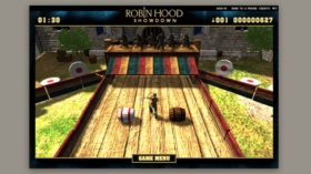
A look back at Robin Hood - Specialmoves

A look back at
Robin Hood
Playgroup
Anyone who makes games will tell you that creating a good, complex and subtle experience takes a tremendous amount of effort. Leafing through the Specialmoves archives recently, it’s not surprising that this job jumped out for looking really very difficult. The next thing that became obvious was that the team who worked on it loved every second of it.
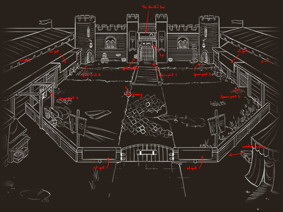
Every scamp and sketch, every model and moodboard in our folders bears the hallmarks of being put together with care and attention. Interestingly, the game that went live in 2009 was nothing like the brief that landed on our desk back in September 2008. That brief was from Playgroup, who originally asked Specialmoves for their thoughts on a live multiplayer Flash game to support online promotion of the BBC drama ‘Robin Hood’. Other than that there were very few other details to go on. Specialmoves effectively had carte blanche on the game concept.
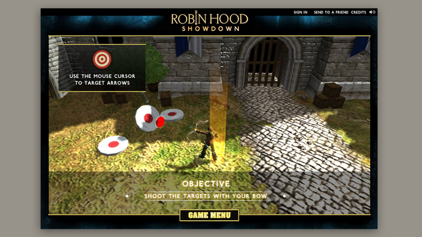
Chi was the creative lead on the Robin Hood project at Specialmoves, and describes his priority as “something with a really simple core gameplay concept, but with a depth that means that if you play it more, you’ll get better at it. It’s about not doing loads of stuff half-arsed. It’s about focusing on the core mechanic of the game.” That mechanic turned out to be a hack/slash and shoot action affair, set in the Sherriff’s castle.
According to Chi, it wasn’t actually convincing Playgroup and the BBC of the new game concept that proved the most difficult part of pre-production; it was selling in the technology we wanted to use to implement it, Unity. Cue a great many demos and prototypes aimed not at working out the ins and outs of different control systems, but at comparing the relative merits of Flash and Unity at delivering a 3D experience.
“When they saw the fluidity of the 3D (in Unity) they were sold on that. Also it was a level of fidelity of 3D on the web which hasn’t been seen at the time. Now you get more bang for your buck, but at the time it showed more of a parity between console gaming and web based games than anyone had really seen.”
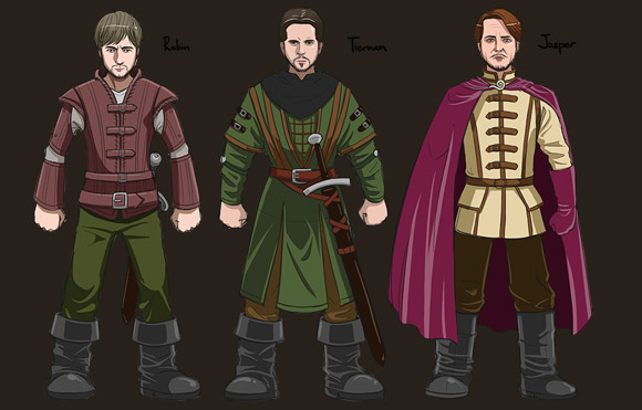
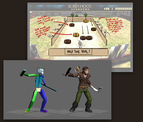
Once the tech was decided and the project fully scoped, it was straight into prototyping and asset generation. Character sketches were developed from video stills, with slightly exaggerated feet, head and hands to make them recognisable from a distance. Once these were signed off, they were translated into 3D models, and then animated according to sheets like the one below.
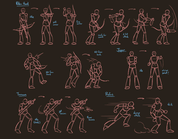
For the team, finding out what kind of animations they needed involved playing early demos of the game and making a note of which movements would be necessary: “We knew roughly what animations we’d need from the prototype – so we knew we’d need (Robin) walking in 8 directions, we’d need a torso which swivelled in a different direction to the legs and point at wherever he had to shoot (which was incredibly difficult, incidentally), we knew we’d need a sword slash for a mouse click, that kind of thing. We’d show the client videos of these animations which they’d sign off.”
Looking through the old animation sheets, there were a fair few which are difficult to spot in the finished game, where enemy guards vanish in a puff of smoke when you hit them, rather than tumbling over.
“The level of violence became an issue – you’re killing guys, and a lot of them, and when we started sourcing sound effects, we found a lot of them were way too visceral. We’ve got early demos where you’re slicing people with huge cleaving sounds and guards were flipping over and falling on the floor with these gurgling dying noises, which was too much.”
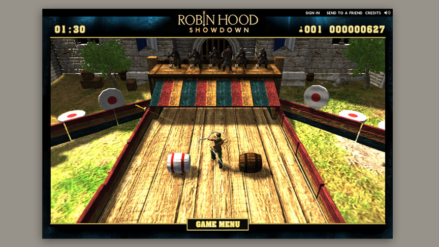
Naturally this was greatly at odds with a BBC programme aimed at children, and so defeating a guard had to be toned down to a puff of smoke and a bag of coins rather than a death rattle, but Chi was satisfied that the result was still a compelling experience all the same. Interestingly enough, discussions over the gameplay also resulted in the late addition of the barrel run, which proved to be Chi’s favourite part of the game.
During development the barrel run rapidly become a medium for competition within the development team, and you can see why – not only does it require swift reaction and co-ordination, but if you’re particularly skilled, allows a player to rack up points by shooting targets and slashing special barrels at the same time.
It wasn’t just the client that we needed to run gameplay by; once the team had a rough and ready prototype they subjected it to the harshest criticism you can get in videogames: 20 schoolchildren from the local neighbourhood. We asked Chi if the playtesting sessions threw up any surprises: “They were all better at it than we thought they would be! We found the kids were way more adept to complicated controls than we anticipated. We didn’t think, for example, that they’d be able to manage well with both mouse and keyboard controls.”
“The other quite startling thing was that none of the kids, not one of them, talked about graphics. Graphical fidelity was not a huge thing for them, it’s more the experience of it, fun things that you’re doing from moment to moment.”

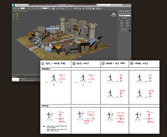
User testing gave the team confidence in the decisions they made, and informed a great deal of work polishing up prototypes for client demonstration. Test subjects also came out with the kind of ideas that only children can: ‘We asked them what they would like to see in the game and they all said stuff like ‘oh, it would be cool if a dragon came out at the end, from the back, and you had to do this to kill them. They all had really vivid ideas of what they wanted from it”.
The project lasted around 4 months from production starting to delivery of final code, leaving scores of sketches, design documents, 3D models, and Papa John’s pizza boxes in its wake. Though we felt we knew the answer already, the final question to Chi was – was this project an albatross around his neck, or a labour of love?
“Oh, labour of love, for sure! For sure."


