Responsive design: a combined workflow - Specialmoves

Responsive Design:
A combined Designer
& Developer workflow
Specialmoves Labs
As a digital company we're always looking to push ourselves to use the latest Tech, Design and Production principles. 'Responsive design' and 'Progressive Enhancement' are amongst the most exciting things happening in web design and development as we speak. And we think we've got some answers as to how designers and developers can better work together to visualise and build responsively.
The idea behind Responsive design & Progressive Enhancement is to take web design back to its original purpose: to engage the user through the delivery of important content. The problem we're trying to solve can be summed up as follows:
“How can we deliver content across a multitude of platforms without diminishing the experience? And without there being any detrimental effect on the content?”
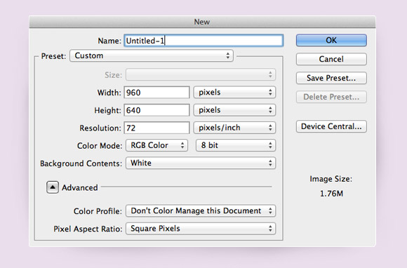
In order to achieve brilliant content delivery across platforms, and deliver responsive design, we need to modify our current design & development workflows. Currently nearly every designer works within a fixed environment (Photoshop etc.), where your starting point is to set the dimensions. Restricting our content from the off, isn't conducive to working responsively. A fixed design is passed to a developer who initiates their own workflow. Historically, other than checking in sporadically to make changes there isn’t much communication between the two skill-sets.
Mobile first
With Project Zeus (our new site build) our solution was to put mobile first, using Luke Wroblewski’s principle of using Progressive Enhancement to enhance the experience. Instead of creating a desktop design and “shoe-horning” it to work with smaller devices, we looked at the smaller devices first and built up from there. This way we could guarantee that our content was available to all platforms & devices.
The project workflow
Our project was created by 3 dev’s (1 backend, 2 frontend) & 2 designers. I wanted to make sure the designers knew how to produce a design that would work with the mobile first approach.
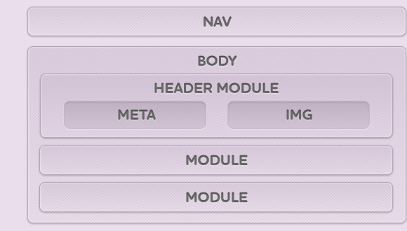
Firstly, the designer & I looked at our content and the site-map, from there we created some base layer components.

Everything would sit within these components, then we looked at where our media query break-points would be using.
- 320px - mobile
- 768px - tablet
- 960px - desktop
- 1200px - larger desktops
We then attacked each component as a separate design, firstly the designer would create the component in its smallest form within Photoshop, we then took that design and built a working version.
Our new workflow
With responsive design it’s crucial that the designer & developer have a close working relationship, so as designs are created they are being tested. It’s difficult to communicate how a design should work so we found putting it in the browser asap helped. The overall requirement of the website was a simple, yet engaging design using large imagery rather than complex graphic design, which lent itself to the responsive idea brilliantly. As most of the design could be created via CSS, once we had the basic design prototyped, the designer was free to tweak it within the browser.
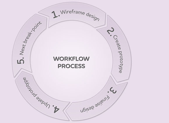
How it works
- Wireframe design to breakpoint (320px)
- Create prototype in browser
- Finalise design within Photoshop/browser
- Update working prototype
- Move to next break-point (768px) and repeat......
Conclusion
Think about your content first, rather than the design. Work within a fluid environment: create wireframe designs within Photoshop first but then test in the browser. This way you can create a fully fluid, device agnostic layout.
Coming from a design background, I'm a firm believer that a mixed developer/designer role is the way forward. Within this project we had our designers working with HTML & our developers working with the design. I believe this made for the best outcome as our content can reach the widest audience possible whilst maintaining an engaging experience.
We now have a new workflow which better suits the responsive approach, it's rough and needs work but already our designers are getting excited as much as us developers are about the possibilities.
I'd love to hear about anyones experience with implementing responsive design in a project and their own workflows, so if you have your own thoughts do let us know!
What's next?
Going forward I believe there is scope to further the use of conditional loading in delivering assets & even content depending on device/browser. Ajax is a distinct possibility with Jeremy Keith exploring a method here to deliver a news stream.
We also want to get our designers working with HTML & CSS more, so we have already run workshops on introducing these 2 technologies. Eventually we want designers to be able to work within the browser and experiment with their designs.
Is the responsive approach strictly for the design? Let's think about applying it to dev roles.
---
Ciaran is a the HTML/CSS Standards Lead at specialmoves where he spends a lot of time resizing his browser when browsing the web @ciaranpark
Follow us on Twitter @specialmoves