Capes and Aliens - Specialmoves

Capes and Aliens
Specialmoves Labs
In a studio meeting the other day, Steve (one of our developers) presented a little iPad game that he'd mocked up in a few days. It was simple, but nifty - you move the 'Green Atom' character whilst avoiding and destroying asteroids that appear from the top of the screen. We all fought to have a go and a rugby tackle later, I had the iPad in hand. It felt responsive and smooth and most importantly, good fun!
As dev-led projects tend to go, all the art assets were stock bits and bobs - the rewards of many a Google 'Image Search'. There was some great humour in it, but it all needed a bit of designer loving. We thought we'd design a few characters and elements to bring it all together as a side project to brush up our drawing skills. Steve gave us a folder containing all the assets with a brief of "Take 'em and make 'em shiny!". Or something like that.
Animating the Green Atom
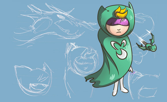
The first thing I did was to mock up a quick character design, the idea being that once we were happy with his general look, I could crack on with drawing the animation frames. Normally, you'd spend time drawing the character from all angles, creating a 'character study' document. Since we didn't have too much time, I figured I'd work off the one picture and make up the rest as I went along!
Most superheroes tend to consist of only a couple of colours which works great for game design as your character can really stand out from the background. Imagine how hard it would be to play a Spiderman game if he was dressed in a multicoloured suit..! Green and purple were a nice combo and fit a little with the whole 'spacey' theme.
The original prototype used 3 frames for the main character: 1 x top down, 1 x left-profile, 1 x right-profile. It looked a little flat in motion - something that a few idle frames can remedy.
I started with the top down frames. His cape was the element that really had to animate, so I focused firstly on that. A few extra touches were also fun to add, such as his hair quiff, the little bit of lighting on his hood and the boost under his feet. The line art is crucial to everything, so it's important to lock that down before busying yourself with posh things like shading, etc. Here are the basic steps I adhered to:
1) Draw line art
2) Duplicate line art and modify animating objects ( 'onion skinning' technique)
3) Once all the line art frames are complete, paint the flats (flat colour fills)
4) On a layer above, paint all shading/highlights
All painting was done in Photoshop, using a Wacom Intuos 4/5 (depending on whether I was at home or in the studio!). The basic circular brush is more than adequate, obviously with smoothing turned on for natural, pressure-based line tapering. The Spriters Resource is a great site for reference (though the sprite rips are of questionable legality).
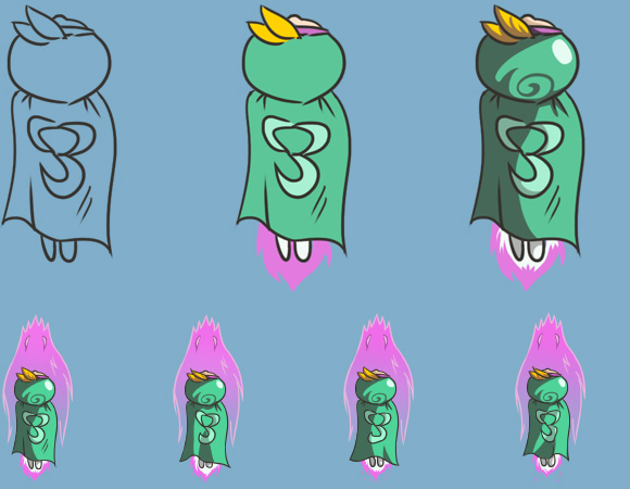
Once the idle animation looked good, I moved on to the left-profile frames. From the side you can see his little arms, legs and face details which were really fun to draw. For the right-profile, I duplicated the left-profile line art and tweaked little details like the asymmetrical Specialmoves logo on his cape. The shading is also different in the right-profile frames.
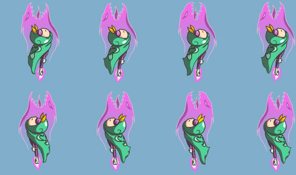
Since the Green Atom's proportions are exaggerated for 'cuteness', there is no way that his arms would be able to reach far enough past his head to punch the asteroids. Head-butting the enemies also looked really strange, so in a bit of retroactive reasoning, I added a Dragonball/Visionaries-inspired dragon aura to do all the killing for him. The aura ended up being my favourite thing to draw - what's not fun about drawing massive teeth and evil eyes!
The last touch was a custom animation for the Green Atom's super attack - a move you can trigger by swiping downwards once you have accumulated enough power. Steve had created a circular spinning particle effect, which looked amazing, but didn't seem to fit with the standard idle animation (the aura's head was poking out a little at the front, etc). A couple of custom frames later and bang, all looked better! A custom png of the aura was created to rotate around the Green Atom with code (saved me outputting unnecessary graphic assets).
Steve used his particle gun to add particles for the Green Atom's trail and attacks which made everything look instantly cooler. If we had more time, it would have been great to prep some extra 'hurt' and 'death' animations, but there's always something.

In space, no one can hear you avoid asteroids
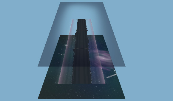
Before moving onto the enemy graphics, the background art was something I really wanted to pin down. An iPad is quite a large screen area and without decent background art, all the work you put into the characters is wasted. After deliberating between a 'city from above' and 'space', we decided to go with space as it was a nod to what the prototype used. Also, stars and galaxies are far easier to draw than an intricate cityscape! The prototype used 2 background layers moving at different speeds to create a basic parallax effect. We ended up going with 3 layers in the end as it offered us an extra level of depth (1 x distant space, 1 x close objects, 1 x stars whizzing past for a sense of intense speed).
The whole background was painted up in Photoshop at double size (you never know when you want a higher res asset!). Each of the 3 layers had to tile vertically. This was easy for the space colony (essentially a tube) and stars, but slightly harder with the gradient background. Each layer was then exported as a 1024 x 768 png. To tie everything together, I also exported a vignette image to sit on top. It just helped frame everything more nicely.
Things that kill you
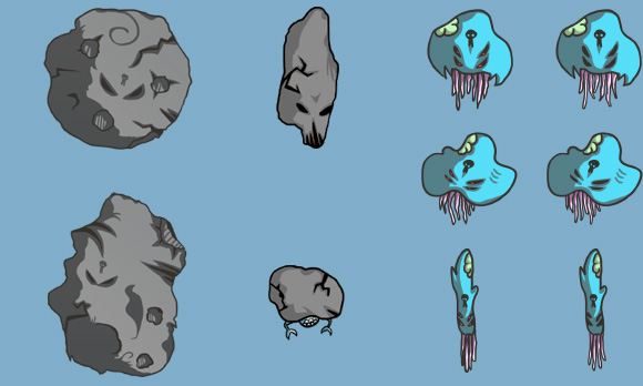
This started off as the easy part. Knock out a few asteroids and be done with it! Emma, one of our designers, created some astroid shapes that looked really cool. I quickly traced over them to make them more consistent with the line art of the Green Atom, and added some evil eyes and skull tattoos (what bad asteroids don't have evil eyes and skull tattoos…).
What I didn't realise from playing the original prototype was that you can kill some enemies but not others. Obviously, if all the enemies look the same then there is no distinction between what you're supposed to destroy and what to avoid. To fix this, I drew a few brightly-coloured alien enemies to become the objects that you should kill, and then used the asteroids as the indestructible objects. The contrast worked really well from a gameplay perspective.
UI
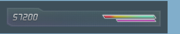
On top of the all the gameplay graphics of course sits the user interface. Matching the space theme, Emma designed a techy-style background for the various bars and numbers to sit on top of.
Typefaces is a useful app that shows you all the fonts that exist on your iPhone. The benefit of this is that you're referencing available fonts and not having to include custom fonts as part of your bundle (which in turn brings up the issue of licensing). We found a digital-style font "DB LCD Temp" that fit just right. The energy bars are 2 pngs each, one for the background, and one for the coloured bar that is masked in.
Learnings
It was a great bit of design practice to pull so many assets together in such a short time. It's sometimes refreshing not having time to be precious as it allows you to focus on the core design and leave the twiddling for another day. We’ll be posting another article about the tech build of the app - come back for that to see the game in action!
---
Costas is a designer at Specialmoves.
He is not Sheldon from the Big Bang Theory. @pixelofpower
Follow us on Twitter @specialmoves